GT Canon

Family overview
- Condensed
- S Light Italic
- M Light Italic
- L Light Italic
- S Regular Italic
- M Regular Italic
- L Regular Italic
- S Medium Italic
- M Medium Italic
- L Medium Italic
- S Semibold Italic
- M Semibold Italic
- L Semibold Italic
- S Bold Italic
- M Bold Italic
- L Bold Italic
- S Heavy Italic
- M Heavy Italic
- L Heavy Italic
- S Black Italic
- M Black Italic
- L Black Italic
- Narrow
- S Light Italic
- M Light Italic
- L Light Italic
- S Regular Italic
- M Regular Italic
- L Regular Italic
- S Medium Italic
- M Medium Italic
- L Medium Italic
- S Semibold Italic
- M Semibold Italic
- L Semibold Italic
- S Bold Italic
- M Bold Italic
- L Bold Italic
- S Heavy Italic
- M Heavy Italic
- L Heavy Italic
- S Black Italic
- M Black Italic
- L Black Italic
- Standard
- S Light Italic
- M Light Italic
- L Light Italic
- S Regular Italic
- M Regular Italic
- L Regular Italic
- S Medium Italic
- M Medium Italic
- L Medium Italic
- S Semibold Italic
- M Semibold Italic
- L Semibold Italic
- S Bold Italic
- M Bold Italic
- L Bold Italic
- S Heavy Italic
- M Heavy Italic
- L Heavy Italic
- S Black Italic
- M Black Italic
- L Black Italic
- Extended
- S Light Italic
- M Light Italic
- L Light Italic
- S Regular Italic
- M Regular Italic
- L Regular Italic
- S Medium Italic
- M Medium Italic
- L Medium Italic
- S Semibold Italic
- M Semibold Italic
- L Semibold Italic
- S Bold Italic
- M Bold Italic
- L Bold Italic
- S Heavy Italic
- M Heavy Italic
- L Heavy Italic
- S Black Italic
- M Black Italic
- L Black Italic
- Expanded
- Mono
- Light Italic
- Regular Italic
- Medium Italic
- Semibold Italic
- Bold Italic
- Heavy Italic
- Black Italic
Subfamilies
- Standard S LightBalance is not symmetry. It is the tension between collapse and coherence. Therefore, it is the opposite of stillness. To speak of balance is to invoke the condition of something being held and not to be fixed. No conclusion but an ongoing relation.
- Standard M LightWhatever is scaled inevitably changes. The morphology of insects versus that of humans. The differing stability of small and large load-bearing structures in architecture. The behaviour of algorithms that perform well on small datasets yet falter when applied to billions of inputs.
- Standard L LightDesign is always an act of presumption. I do not design from the position that I am entitled to. I am not a chair. Horses have never painted humans on a wall. It is a common misconception that the means of design must reflect—or even find their equivalent in—the social and biographical conditions of their production.
- Standard S Light ItalicWe meet in blurriness. If we understood each other completely, we would be identical and weightless, dissolving into pure oneness. Until that happens, however, recognising our differences and contrasts helps us to come closer together.
- Standard M Light ItalicConsidering that the little party had been seated round the tea-table for less than twenty minutes, the animation observable on their faces, and the amount of sound they were producing collectively, were very creditable to the hostess.
- Standard L Light ItalicOn the other hand, tools and designs are tailored to the user to such an extent that they do not even need to be used, as every possible action is anticipated, thus becoming literally useless, and the user, around whom everything revolved, has been relieved of their usage. Free, weight-, timeless and a fence observer. Rather than being oppressed by tradition and forced to master the tool as it has been forged over hundreds of years of craft.
- Standard S RegularA face embodies character: the severity of a brutalist façade, the lightness of thin display cut, the friendliness of rounded terminals. The face is also about recognition: we know a style by its face, we choose an object because of the impression it projects.
- Standard M RegularWandering does not leave any traces as long as it keeps up with the wandering of time. Edges mark the threshold of meaning, the moment when sense meets its outside of the inside of the outside of the sentence. And therefore all is exterior.
- Standard L RegularIn recent years, few terms in design have enjoyed such a meteoric rise as the two letters U and X. User experience quickly became the measure of all things. At first glance, there seems to be little wrong with that. Anyone who strives to offer users the best possible experience does not have to be a showman or a charlatan who turns even the simplest interaction into an experience.
- Standard S Regular ItalicBroadly speaking, anatomy refers to the internal architecture of organisms, i.e. how bones, muscles, vessels, nerves and organs are arranged and how they relate to each other to form a functional whole.
- Standard M Regular ItalicIt does not matter what note you play. What only matters is which note follows, a legendary trumpet player once said (in a pretty different way, but that is how I remember the quote).
- Standard L Regular ItalicAnatomy is the gesture of dividing the visible to seek what cannot be seen. Anatomy is the scientific study of the structure of living organisms.
- Standard S MediumTools supporting interaction design. At the same time, we can observe a trend towards reduced interaction surfaces. Users increasingly ask than navigate. Which increasingly reduces the area of contact.
- Standard M MediumA weight here presupposes a counter there, even if that counter is nothing but the absence of its here with reversed signs. Balance does not eliminate difference; it activates it, arranges it, gives it place.
- Standard L MediumBalance is not symmetry. It is the tension between collapse and coherence. Therefore, it is the opposite of stillness. To speak of balance is to invoke the condition of something being held and not to be fixed. No conclusion but an ongoing relation.
- Standard S Medium ItalicAn instance can be a subsequently submitted determination of a limited point in time. In most cases, however, it marks the section of a defined sequence.
- Standard M Medium ItalicQuoting is a technique of remembering. When we quote, we conjure up the past. We bring a text or an image from another time and place into a new environment. Remembering is a transformative process: what we remember is altered by adding, omitting or rewriting. The house is now red.
- Standard L Medium ItalicWhether we view design as ‘creating with existing means’ or not, upon closer inspection, design has always been about constantly arranging things, and not just since the advent of computers. The ongoing alignment of shapes, images, letters with one another and within their surface.
- Standard S SemiboldA cock was once strutting up and down the farmyard among the hens when suddenly he espied something shinning amid the straw. “Ho! ho!” quoth he, “that’s for me,” and soon rooted it out from beneath the straw.
- Standard M SemiboldYou will rejoice to hear that no disaster has accompanied the commencement of an enterprise which you have regarded with such evil forebodings. I arrived here yesterday; and my first task is to assure my dear sister of my welfare.
- Standard L SemiboldSince design means composing contrasts, creating tension can be a consequence. It’s not inevitable though. Contrast is no guarantee that tension will emerge. Quite the opposite. Tension is a rare commodity. Too much,and it dissipates. Often, the sweet spot lies in drawing the bow just far enough that it does not break.
- Standard S Semibold ItalicBalance is not symmetry. It is the tension between collapse and coherence. Therefore, it is the opposite of stillness. To speak of balance is to invoke the condition of something being held and not to be fixed. No conclusion but an ongoing relation.
- Standard M Semibold ItalicTo justify is to align. Be it aligning things or arguments, be it the alignment of an action and its actor with their surroundings and the forces that shape them. Who justifies, aims to shift the object of his or her justification, either in relation to its circumstances or to the object itself.
- Standard L Semibold ItalicQuoting is a genuinely creative practice. Something has always been there before. We create in its stead and carry it forward. On quiet soles we walk, torchbearers with the blowpipe tucked behind the ear, moving through the forest in search of our prey.
- Standard S BoldQuoting is a technique of remembering. When we quote, we conjure up the past. We bring a text or an image from another time and place into a new environment. Remembering is a transformative process: what we remember is altered by adding, omitting or rewriting. The house is now red.
- Standard M BoldThere are many differences between texts and images, but one in particular is often emphasised: while images can be grasped in an instant, the meaning of a text can only be understood once all of the words have been registered.
- Standard L BoldIn the one the principles are palpable, but removed from ordinary use; so that for want of habit it is difficult to turn one's mind in that direction: but if one turns it thither ever so little, one sees the principles fully, and one must have a quite inaccurate mind who reasons wrongly from principles so plain that it is almost impossible they should escape notice.
- Standard S Bold ItalicA cock was once strutting up and down the farmyard among the hens when suddenly he espied something shinning amid the straw. “Ho! ho!” quoth he, “that’s for me,” and soon rooted it out from beneath the straw.
- Standard M Bold ItalicIt is too simplistic to equate the broadening of the denominator with an expansion of the numerator. Yet, there lies a sever misconception and danger in this term. Not so much because the dividing lines between users and manufacturers are supposedly becoming increasingly blurred in the rapidly changing digital landscape, but rather because of an ontological misconception in believing that the acting subject knows not just the rational and motives behind it’s actions, but also knows itself, and considers the urge of knowing itself as a invisible but leading design principle.
- Standard L Bold ItalicWalter Sills labored for years as an unknown laboratory worker—but at fifty he makes his great discovery! Fame, riches are to be his fate—until interference looms up in the form of a few unreliable characters—and Nature herself!
- Standard S HeavyQuoting is a technique of remembering. When we quote, we conjure up the past. We bring a text or an image from another time and place into a new environment. Remembering is a transformative process: what we remember is altered by adding, omitting or rewriting. The house is now red.
- Standard M HeavyLayouts can be balanced or not, regardless of whether they are symmetrical or asymmetrical. A sculpture can teeter and still rest. Our task is not to enforce equilibrium, but to find the point where the space begins to breathe.
- Standard L HeavySince design means composing contrasts, creating tension can be a consequence. It’s not inevitable though. Contrast is no guarantee that tension will emerge. Quite the opposite. Tension is a rare commodity. Too much,and it dissipates. Often, the sweet spot lies in drawing the bow just far enough that it does not break.
- Standard S Heavy ItalicEdges mark the threshold of meaning, the moment when sense meets its outside of the inside of the outside of the sentence. And therefore all is exterior.
- Standard M Heavy ItalicDorothy lived in the midst of the great Kansas prairies, with Uncle Henry, who was a farmer, and Aunt Em, who was the farmer’s wife. Their house was small, for the lumber to build it had to be carried by wagon many miles.
- Standard L Heavy ItalicThere are many differences between texts and images, but one in particular is often emphasised: while images can be grasped in an instant, the meaning of a text can only be understood once all of the words have been registered.
- Standard S BlackAn instance can be a subsequently submitted determination of a limited point in time. In most cases, however, it marks the section of a defined sequence.
- Standard M BlackIt is too simplistic to equate the broadening of the denominator with an expansion of the numerator. Yet, there lies a sever misconception and danger in this term. Not so much because the dividing lines between users and manufacturers are supposedly becoming increasingly blurred in the rapidly changing digital landscape, but rather because of an ontological misconception in believing that the acting subject knows not just the rational and motives behind it’s actions, but also knows itself, and considers the urge of knowing itself as a invisible but leading design principle.
- Standard L BlackWith this comes an epistemic shift: Drawing and model are interrelated, like hands touching each other. Each hand both touches and is touched, with their roles constantly shifting. And so drawing is not merely a representation of the model, and the model is not merely the origin of the drawing.
- Standard S Black ItalicWhen quoting, words do not necessarily have to change, and yet most things do alter. Typeface, layout, screen, print technology, paper, context, means of distribution. Quoting always raises the question of origin and our relationship to it. What is it that we change when we quote?
- Standard M Black ItalicAnd it is only the sequence of several nodes that determines the appearance. But especially in the visual realm, they lead a dubious existence. On the one hand, they are image-forming in vector image production, making it possible to create contours and surfaces in the first place; on the other hand, they ultimately recede behind the given image.
- Standard L Black ItalicYou will rejoice to hear that no disaster has accompanied the commencement of an enterprise which you have regarded with such evil forebodings. I arrived here yesterday; and my first task is to assure my dear sister of my welfare.
- Settings
Typeface information
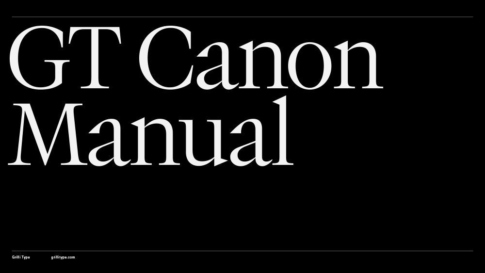
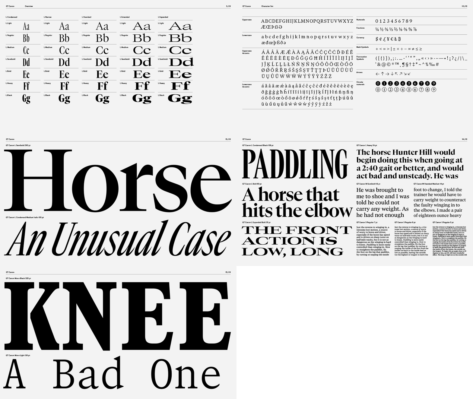
GT Canon’s design is pragmatic but not static: movement and liveliness are embedded in the letterforms. It is our answer to what our digital times require of a serif today. It’s what a contemporary serif should be in both form and function. Like its sans serif sibling, GT Standard, it aims for modern functionality rather than stylistic reinvention.
- Designed by Grilli Type
- Released in 2026
- Available in 224 styles
- GT Canon is available for customization and language extensions
- Download the free trial fonts
Typeface features
OpenType features enable smart typography. You can use these features in most Desktop applications, on the web, and in your mobile apps. Each typeface contains different features. Below are the most important features included in GT Canon’s fonts:
- TNUM
- Tabular figures
0123456789
- ONUM
- Oldstyle figures
0123456789
- SMCP
- Small Caps
Anatomy
Typeface Minisite
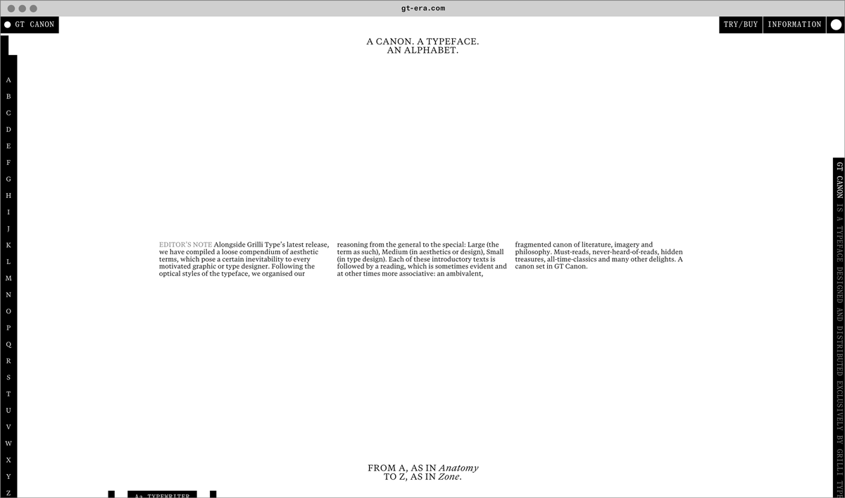
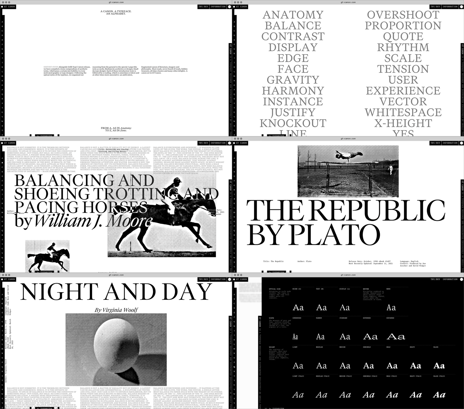
- Visit the GT Canon minisite to discover more about the typeface family’s history and design concept.
GT Canon in use